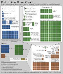
Although this interesting chart made for the rest of us, can seem to be complicated at first sight, you should give it a try. It’s actually very easy to understand. Just start reading on top left at the blue squares, then to the greens on top right and then the red ones. It’s giving us a very good idea of how much radiation is coming from everything, from a banana to a nuclear reactor meltdown. Thanks to Randall Munroe & co, this can serve the health of humanity.
This radiation dose chart is for general education use only, not for safety procedures!
The picture is in the public domain, so you can republish it without restriction.
Wishing all the best and strong health to the people of Japan
Please comment if you have any remarks.


Be First to Comment